
This has been an interesting project.
A few months ago I wondered if I could make a mountain biking jersey that could act a bit like a white cane on trails, letting other bikers know that I am visually impaired. This all started off as a fun project doodled on coffee shop napkins.

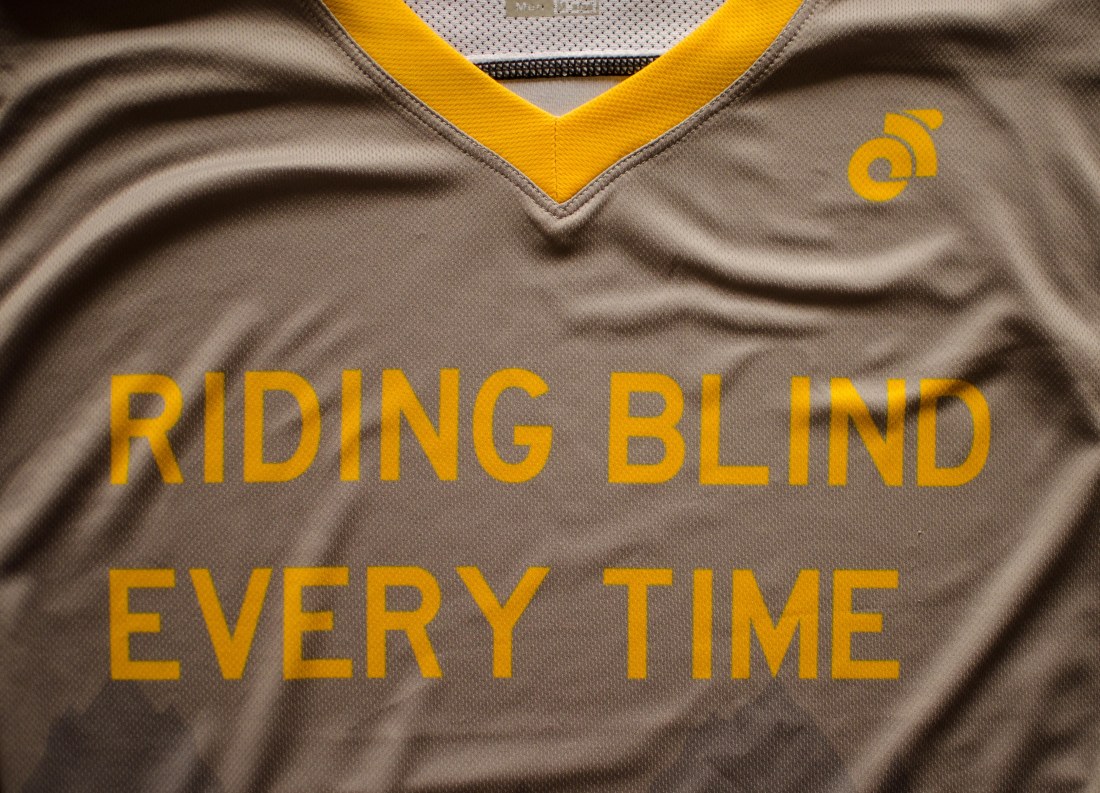
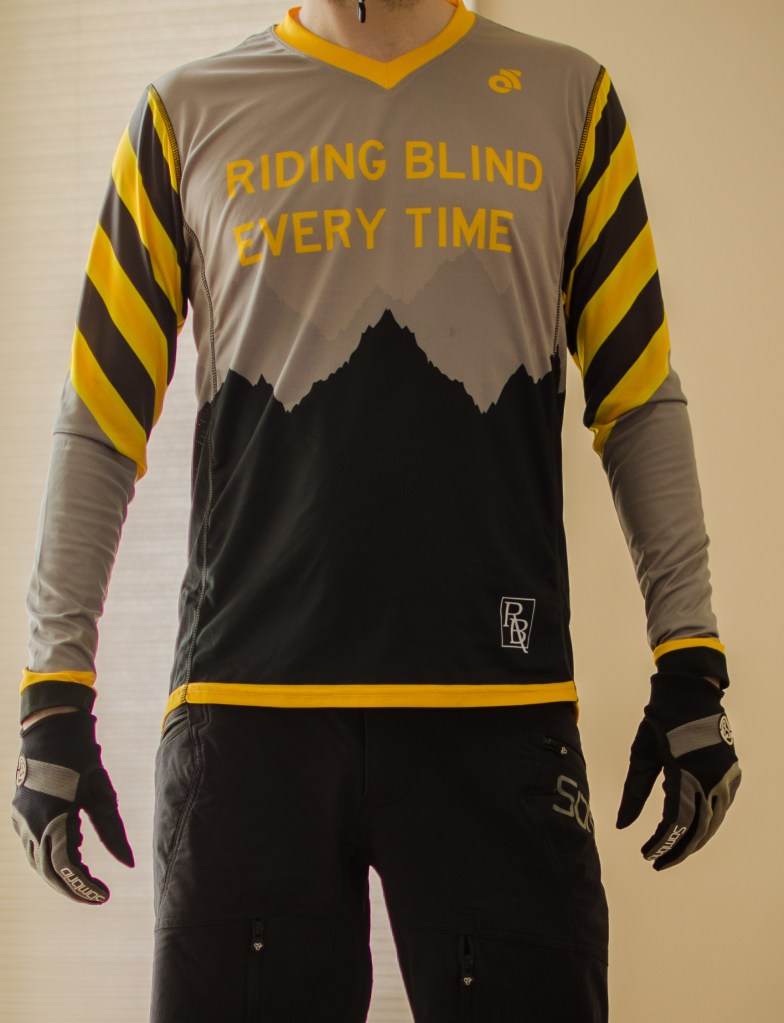
The basic design idea focused on three things, 1. mountains, because, well, mountain biking 2. a traffic hazard pattern on the upper sleeves, the most visible part of the arms from a downhill ‘attack’ riding position, and 3. bold text saying ‘Rider is blind’ on the lower back, where it can still be visible even when wearing a hydration-pack.
I thought of language choice carefully, visually impaired or blind? Which is better? Well there’s not much time to think on a single-track trail with someone coming up behind you fast, so I chose the simplest, shortest and clearest message.
You’ll note the design focused entirely on the back. The front, frankly, didn’t matter much. Colour choice did matter tough, and there were two main high contrast options to choose from; red, white and black, or yellow, grey and black. I never wear yellow clothes, but it won out for a couple of reasons. On traffic signs, it is the colour choice of hazards, cautions and warnings. Also, it simply stood out more and ultimately, standing out and grabbing attention was the point of this shirt.

So that was the basic idea. A friend referred me to Champion System as a good company to work with. They make custom athletic clothes for many different sports, but having no experience, my biggest concern was would a company really help to design and make a single jersey? I mean, most companies focus on teams, schools, clubs and other larger batch productions. Then here I am wanting just a single, odd jersey. I am pleased to say that yes, yes they will help you to design and make a single item of your choice! You’ll have to understandably. pay a bit more it though. You get a big discount by buying in bulk. Buying 1-4 items, you pay the highest price. If you get 5-9 items then the price drops, and 10 or more items gets you the best price. Having no need for 5 jerseys, I was going all in on the pricey side. This was getting serious.
Once you setup an account and leave a $200 deposit with Champion System you are contacted by a Custom Apparel Specialist who helps you through the design-to-production process, and answers any questions you might have. It turned out that my contact also rode a Chromag mountain bike and sounded excited about the project, so things were off to a good start!
The next step was to submit a design brief, along with any image files in vector or pdf file formats. This was probably the toughest stage for me. Due to my vision loss I cannot spend long hours in front of a computer, and this was also my first time preparing or converting image files into clothing print friendly formats. Basically I had to do this in little bits and pieces when the daylight was good, but eventually I collected what I needed and clicked submit.
To keep the jersey clear and easy to read, I chose the same text font as found on traffic signs in all capitals. I was also aware that the yellow on grey slogan on the front would be less visible, but once again, the front didn’t really matter. I didn’t want to have a shirt that when walking around a race event pre-or-post race screams “HEY LOOK AT ME I’M BLIND!” I wanted the front to be quiet in subtle, in comparison to the back which aims to grab your attention and communicate a message quickly.
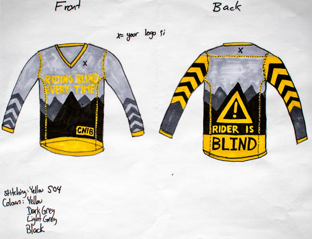
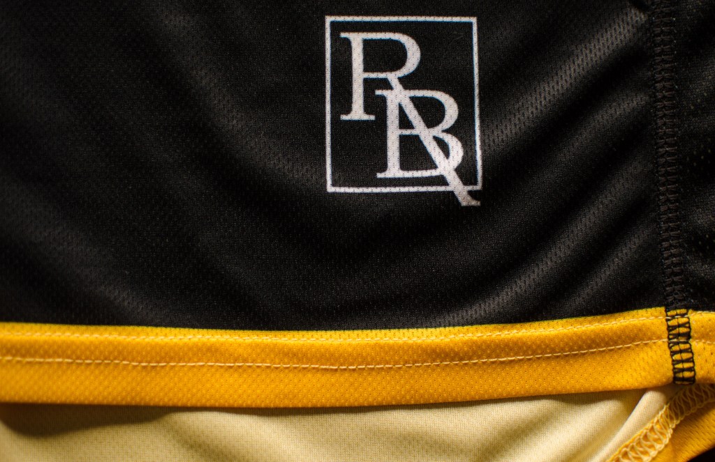
You’ll also notice a little CNIB logo (Canadian National Institute for the Blind) on the front. I had hoped to include the organization’s logo simply because I’ve been stopped and asked a few times about how I bike while ‘blind’ or how ‘blind’ I am. I figured the jersey might be a good conversation starter and possibly a good chance to refer people to CNIB as a source of additional information on vision loss.
A few days later, my ideas and image files were translated into the first design proof.
Not bad for a first draft. Looking it over I came up with 8 desired edits.
- I wanted to see the design on trail cycling, not road cycling shirts
- Delete the clouds from the upper back (it was a bad last minute idea)
- Lower the text of ‘RIDER IS’
- Allign the mountain silhouette with the hazard triangle
- Stagger the second row of mountains up to look like it’s further
- Lighten the grey shade of the second row of mountains
- Make the long sleeves from elbow to wrist this same grey
- Clean up the hazard arrows near the elbow
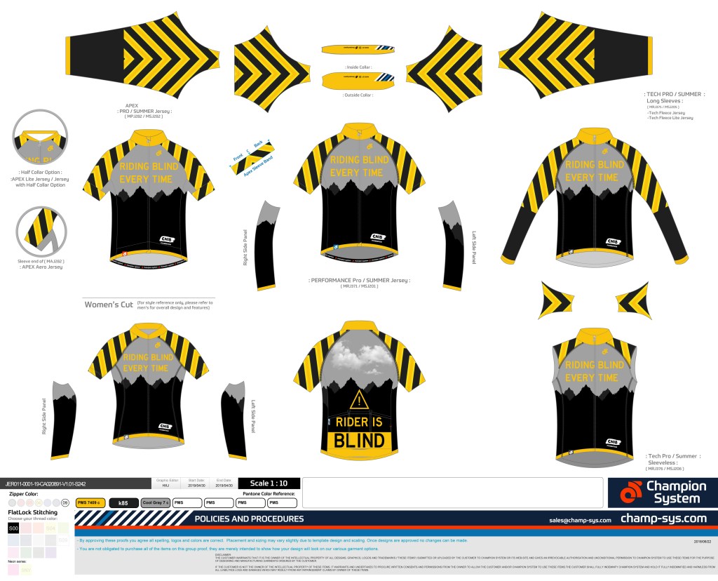
A few days later I got the second proof.

From this I had 3 final requests.
- Raise the sleeve hazard pattern to the elbow on the long-sleeve
- Increase the size of the hazard triangle
- Match the mountain silhouette pattern where there is stitching
I had reached out to CNIB about using their logo because I would not feel right to use it without their permission. After a few leads and phone calls got me nowhere I decided to use this blog’s logo instead.
My final proof came in, I approved it, and submitted an order for 1 short-sleeve t-shirt and 1 long-sleeve jersey. A couple of weeks later and Fedex dropped the shirts off at my door.
The t-shirt is great.

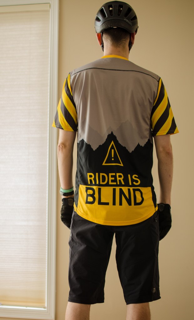
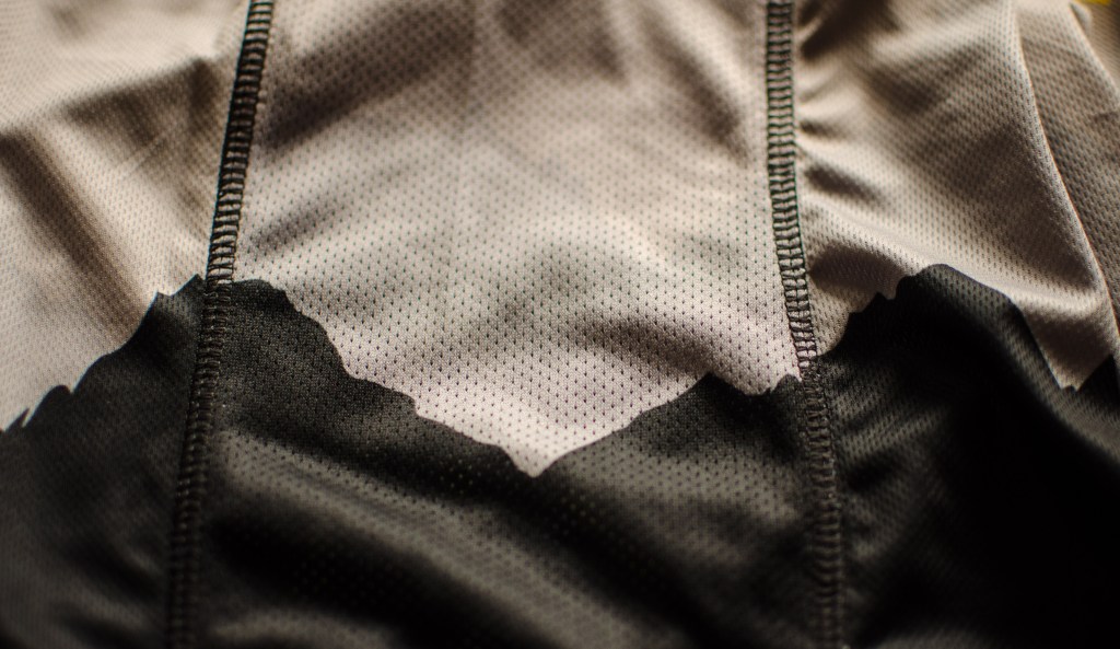
The material is incredibly soft, light and breathable. The sleeves are a single piece of fabric, so it was a little difficult to keep the hazard pattern only on the back of the sleeves. But Champion System did a good job of matching the pattern where stitches are and fabric panels join.

There is a lot of detail in the small logos.
I had ordered a medium long-sleeve jersey since with Sombrio jerseys, the sleeves are actually a little long in medium. I am tall and thin so this is always a gamble. In this case, I should have gone for a large. The shoulders fit well, but the sleeves were just a little too short for comfort. I took them to a tailor and had an extra inch of athletic material added to the sleeves which made them fit better.

Otherwise I am happy with how the hazard pattern sleeves worked out and how the text is still visible under a hydration backpack.

So there you have them. Fully custom Riding Blind trail shirts courtesy of Champion System. This was definitely a learning experience. If, or when I make a second edition of this shirt there are a couple things I will change. Obviously, i’ll get a large long-sleeve jersey. I also want to darken the second row of mountains. At first I thought they were forgotten in the design, but no, they’re there, just very lightly and hard to see. I should have chosen two shades of grey that were further apart. Finally, I still want to try to find a way to make the hazard sleeve pattern only appear from the rear.
Big thanks to Nick Towill and Champion System for helping take my napkin sketches and turning them into slick looking shirts.
If by any chance somebody would like buy a Riding Blind jersey or t-shirt, send me a message at sergepaul.lebrun@gmail.com and we’ll see what can be done.
See you on the trails.
