
This blog was started mostly as a way to record my own journey through vision loss, but there were still chances to have fun with it.
I tried a few ‘free logo designers’ from WordPress and well, you get what you pay for.
After being less than impressed I decided to simply give it a try myself.
I already knew a few of my requirements and started from there. Basically I wanted something 1. simple, 2. easy to see, 3. high-contrast and 4. special to me.
A bit of time in Photoshop and I ended up with what you see at the top of this blog.
The logo was influenced by 3 main influences.
The overlapping letters are a nod to the comic book character Daredevil and the DD logo on his chest.

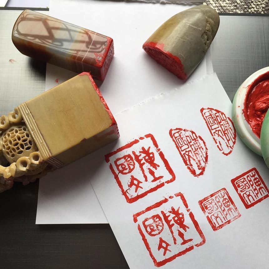
The box around the letters is similar to personalized stamps used in South Korea called Dojang. Originally I had planned to someday use a stamp-style logo for a photography website or blog. In some ways. this blog has replaced that old idea.
Finally, the extended ‘R’ leg does four things. It overlaps like Daredevil’s logo as mentioned earlier, crosses out the loops in the B that look a little like glasses, reminds me a bit of a white cane, and extends to be ‘outside the box’. Might be a bit cliché but I had fun doing it. I might redo or revisit it later to give it a stronger stamp-like appearance but for now I am happy with it.
